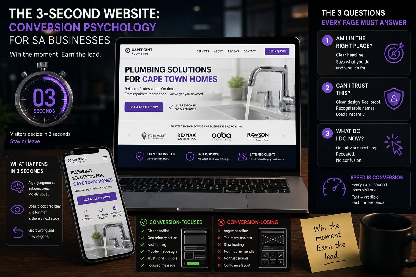
A visitor lands on your website and, within about three seconds, makes a decision that most of your marketing budget depends on: stay or leave. Win that moment and everything downstream has a chance. Lose it and the best offer in your industry never gets read.
What happens in three seconds
Before a visitor reads a word, they form a gut judgement: does this look credible, is it clearly for me, and can I tell what to do next? That judgement is mostly subconscious and largely visual. A cluttered, slow, generic page fails all three tests instantly — and the back button is one tap away.
The three questions every page must answer immediately
"Am I in the right place?" Your headline must say what you do and who it's for, fast. Clever beats clear far less often than designers wish. A visitor who has to work out what you offer has already half-left.
"Can I trust this?" Credibility signals — clean design, real proof, recognisable names, a site that loads instantly — do quiet, heavy lifting. Slowness alone reads as untrustworthy, and South African mobile users on patchy connections are unforgiving of it.
"What do I do now?" One obvious next step, repeated. A page offering five equal choices offers none. Confusion doesn't convert.
Speed is conversion, not a tech detail
Every extra second of load time sheds visitors — and on mobile, in South African conditions, the effect is brutal. Speed isn't a developer's vanity metric; it's the first credibility signal and the first conversion lever. A beautiful site that loads slowly is a slow site. Build fast first, decorate second.
Design that converts vs design that decorates
A site can win design awards and lose every lead. Conversion-engineered architecture starts from the visitor's decision and works backwards: what must they feel, in what order, to act? Every section earns its place by moving the visitor one step closer to the next action — or it's cut. Beauty in service of conversion is the goal; beauty instead of conversion is decoration you paid for.
The mobile-first reality
Most South African traffic is mobile, often on mid-range devices and variable connections. If your site is designed on a designer's large screen and merely "checked" on mobile, you've optimised for the minority. Design for the thumb, the small screen and the slow connection first — then let it scale up. That's where your visitors actually are.
Win the moment, earn the rest
You don't get a second chance at the first three seconds. Get the headline, the trust and the next step right — fast — and you've earned the visitor's attention for everything that follows. Get them wrong and nothing else on the page matters, because nobody's still there to read it.